Outten & Golden
Indsutry
Legal AI
Scope
Rebranding
Market
B2B

THE BRIEF
Outten & Golden's brand had not kept pace with its evolving leadership, ambitions, or culture. As one person inside the firm put it, they had been like Albert Einstein walking around in a bathrobe. Brilliant, solving enormous problems, but the brand did not show it. Internally, the firm was innovating, welcoming new talent, new systems, and new ways of working. They needed a clear brand strategy and identity to express what the firm was truly about, and to prepare it for the next chapter.
THE CRAFT
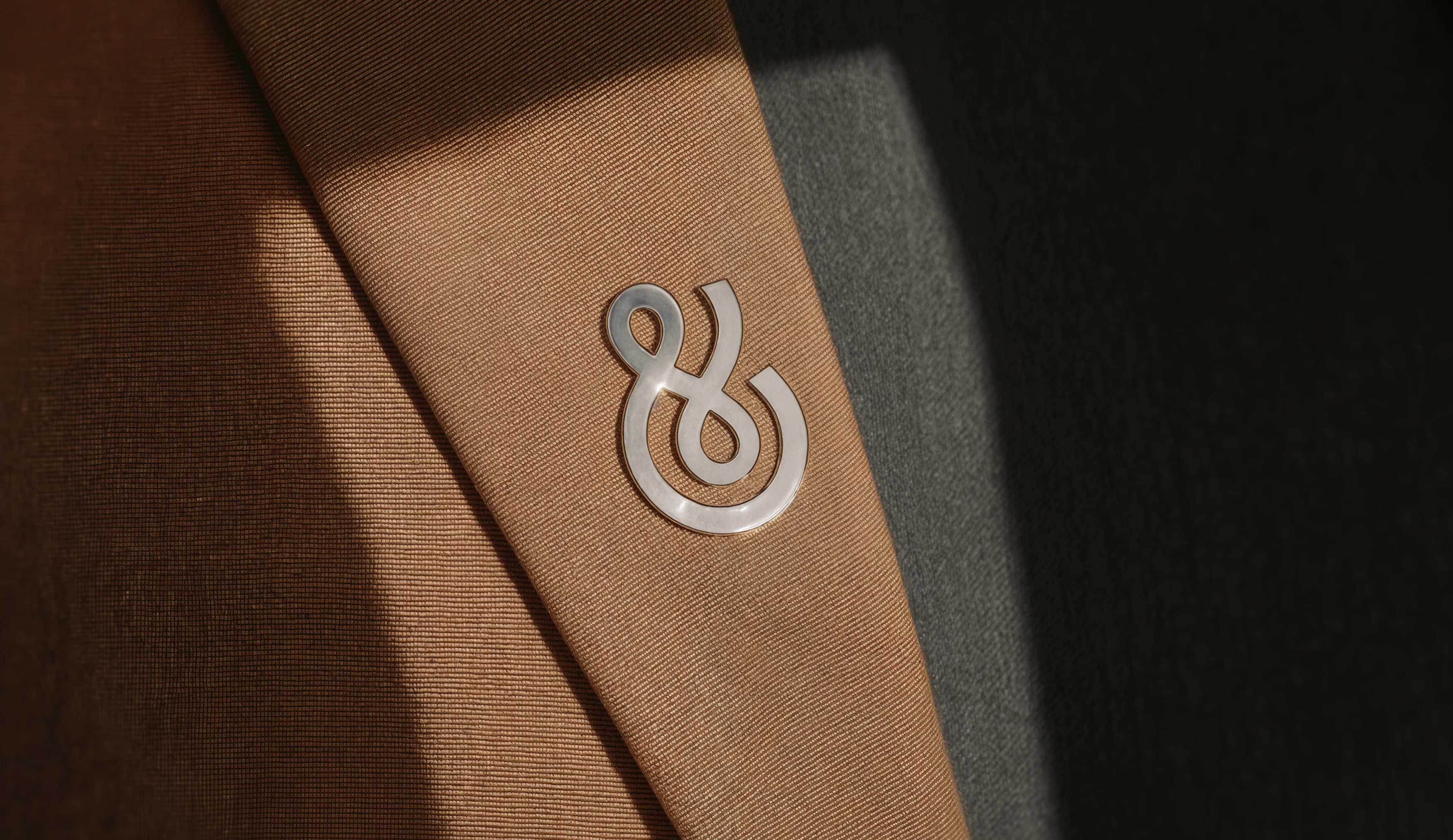
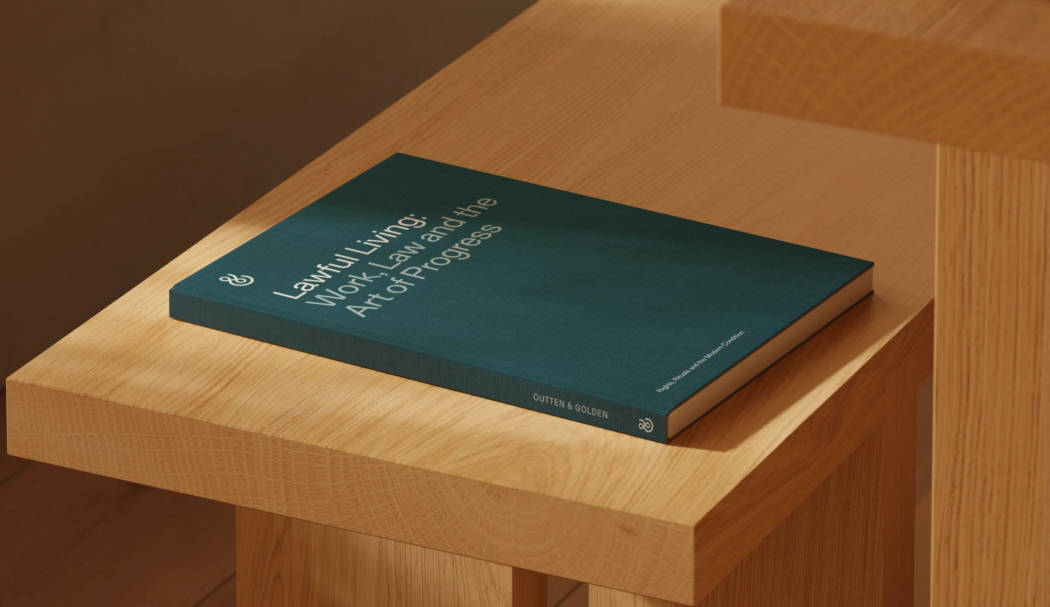
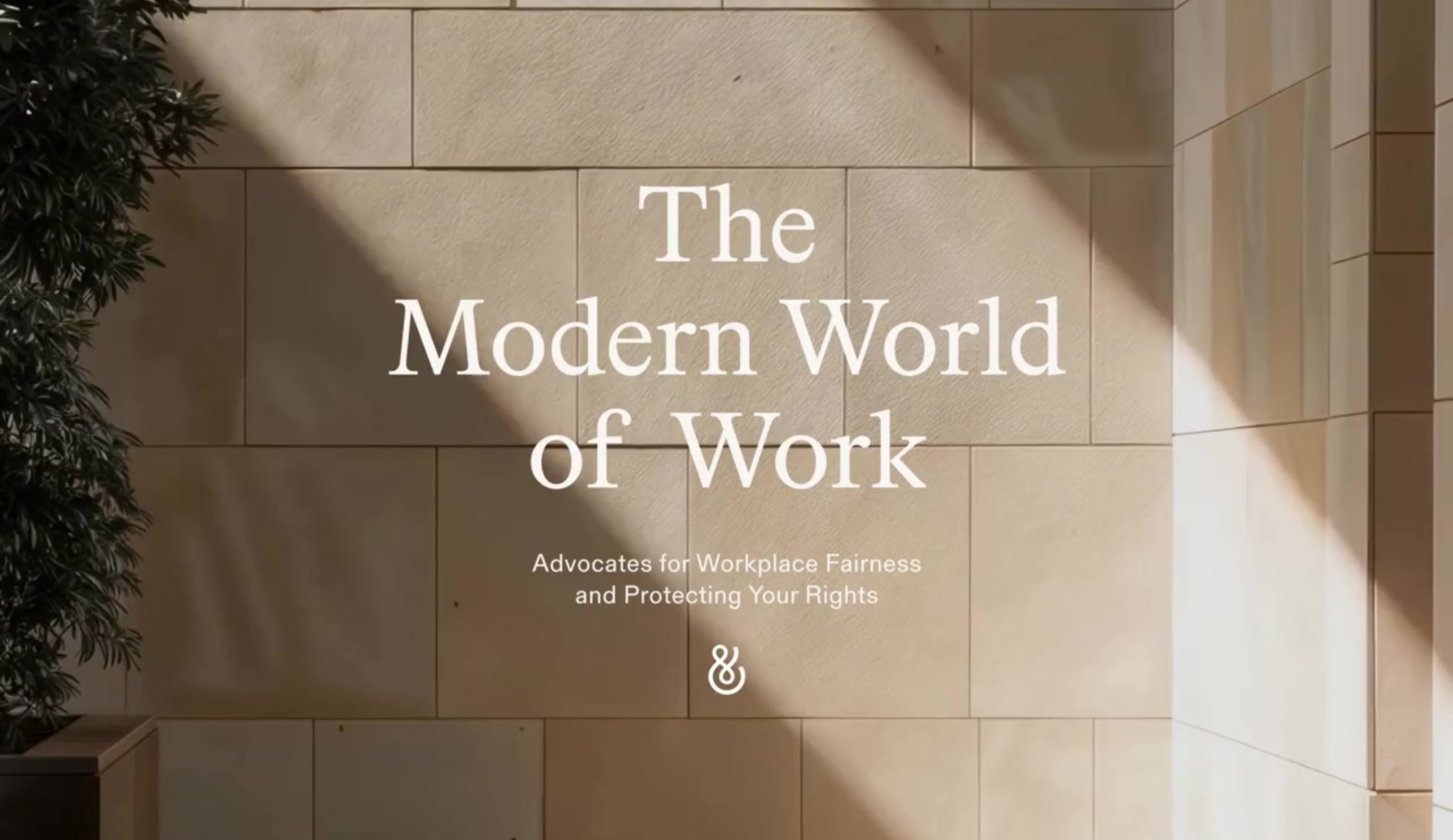
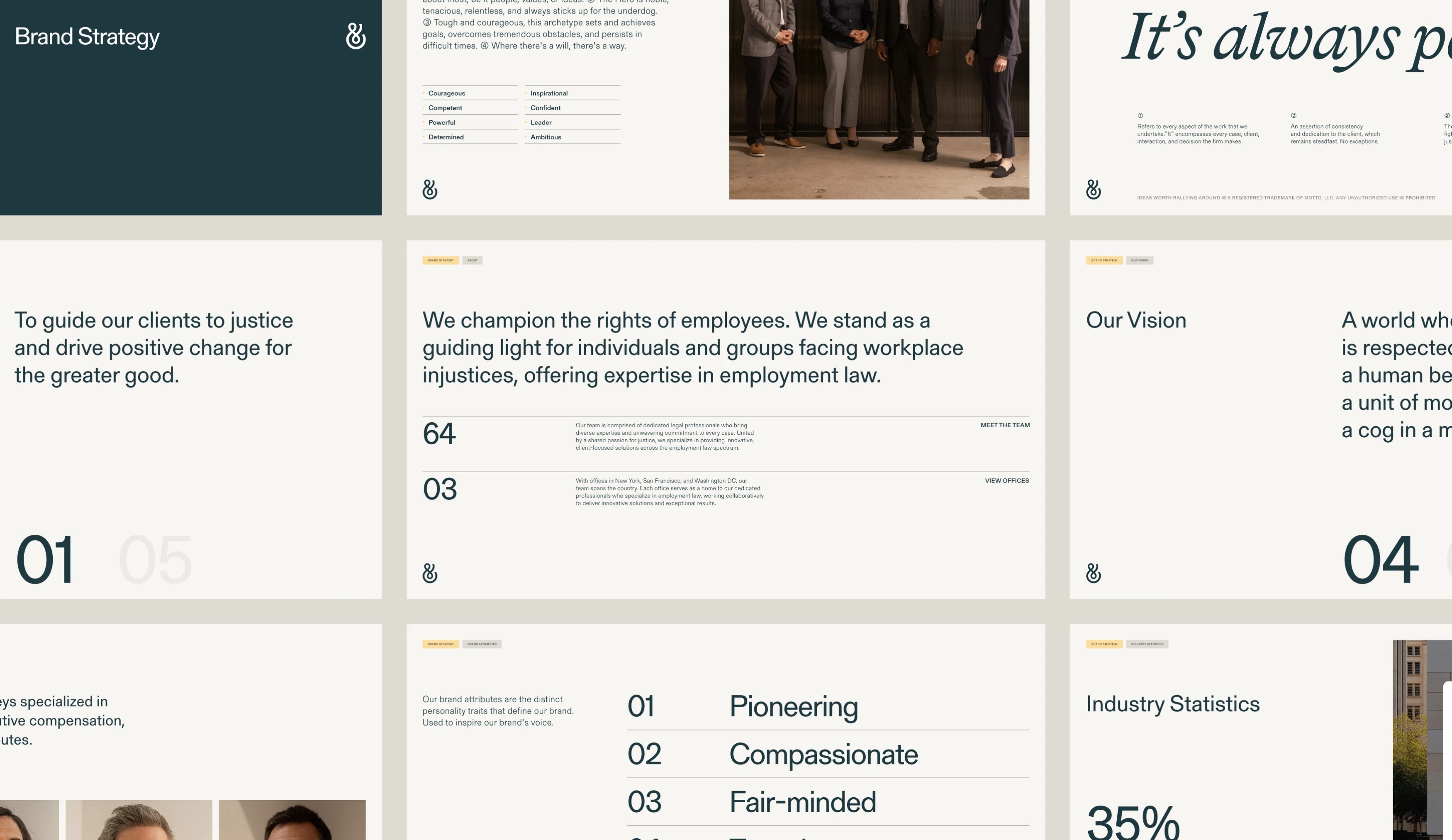
We began by immersing ourselves in the world of Outten & Golden, meeting partners, lawyers, and staff, studying landmark cases, examining the realities clients face throughout the legal process, and analysing the cultural and legal shifts shaping the future of employee rights. What emerged was a rare combination: a firm with the rigour of an elite litigation practice and the warmth of a deeply people-first mission. That tension became the foundation. The idea worth rallying around, It's Always Personal, captures the stakes at the heart of every case. Clients arrive at moments that influence their livelihood and shape their future. This belief positions Outten & Golden not as a firm that handles cases, but as a partner that stands with people when it matters most. The voice built around this idea was given a name: Hope. Grounded and tenacious, empathetic and determined, Hope speaks with clarity and resolve, ensuring every message feels human, mission-driven, and unmistakably Outten & Golden. Visually, the identity balances the gravitas of a top-tier litigation firm with the warmth of its people-first mission. The ampersand at the heart of the logo expresses connection. A combination of serif and sans-serif typography blends expertise with modernity. The colour palette signals optimism, trust, and warmth, deliberately avoiding the cold, generic cues of traditional legal branding. The work extended across a two-city photoshoot in New York and San Francisco with photographer Kyle Johnson, capturing warm, confident, personality-driven portraits. Custom 3D artwork, line illustrations, and infographics gave the brand a distinctive visual language for simplifying complex ideas. A fully redesigned website brought it all together, with UI, UX, and copy crafted to reflect the firm's clarity, resolve, and mission.
THE OUTCOME
Outten & Golden emerged with a brand that finally reflects the quality and humanity of the work it has always done. A clear strategy, a distinctive voice, and a visual identity built on warmth and conviction gave the firm the tools to move into its next chapter with confidence. It's Always Personal became more than a rallying cry. It became the lens through which everything the firm does can be understood.