Avera
Indsutry
Beauty
Scope
Branding
Market
B2C
THE BRIEF
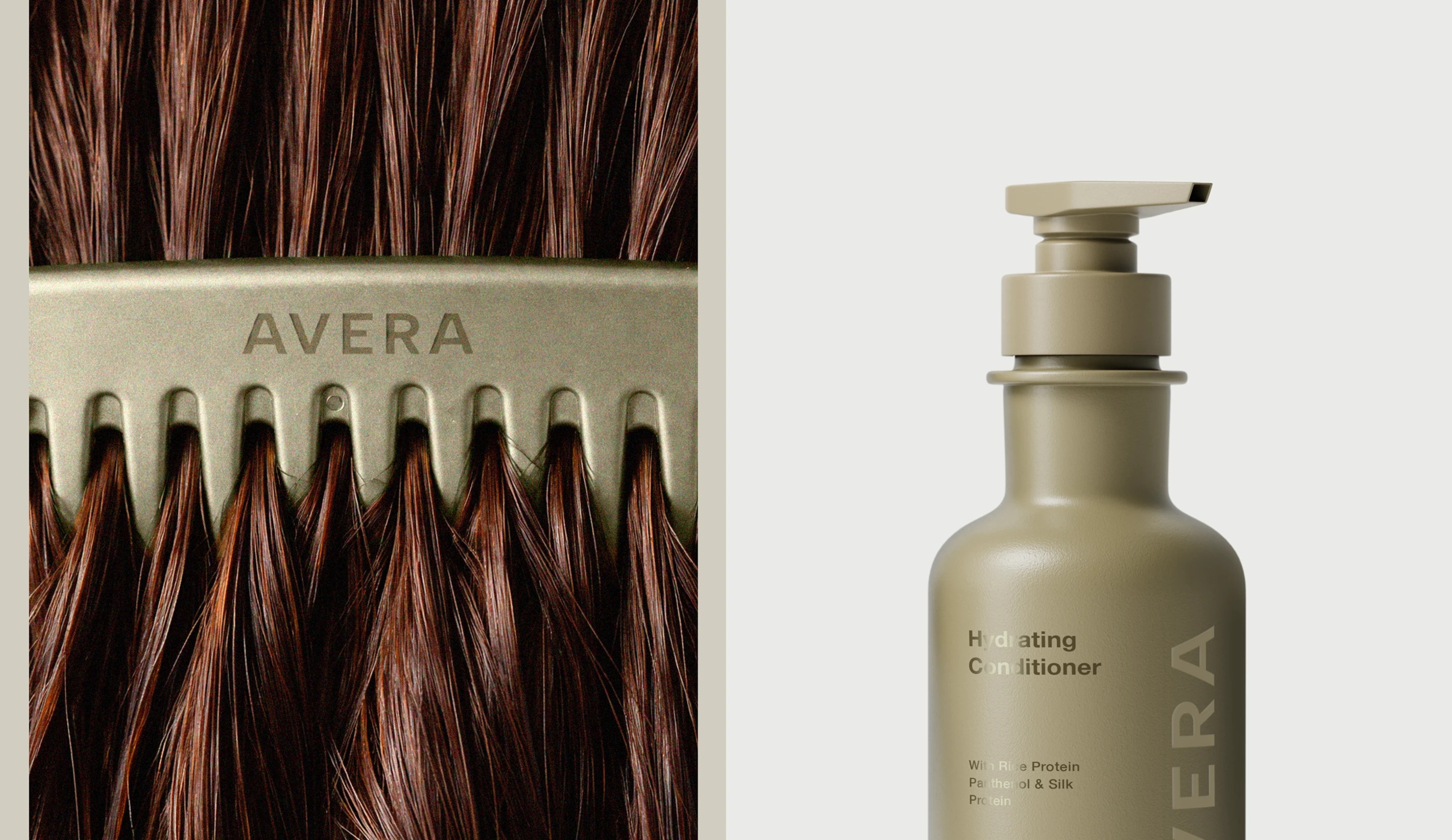
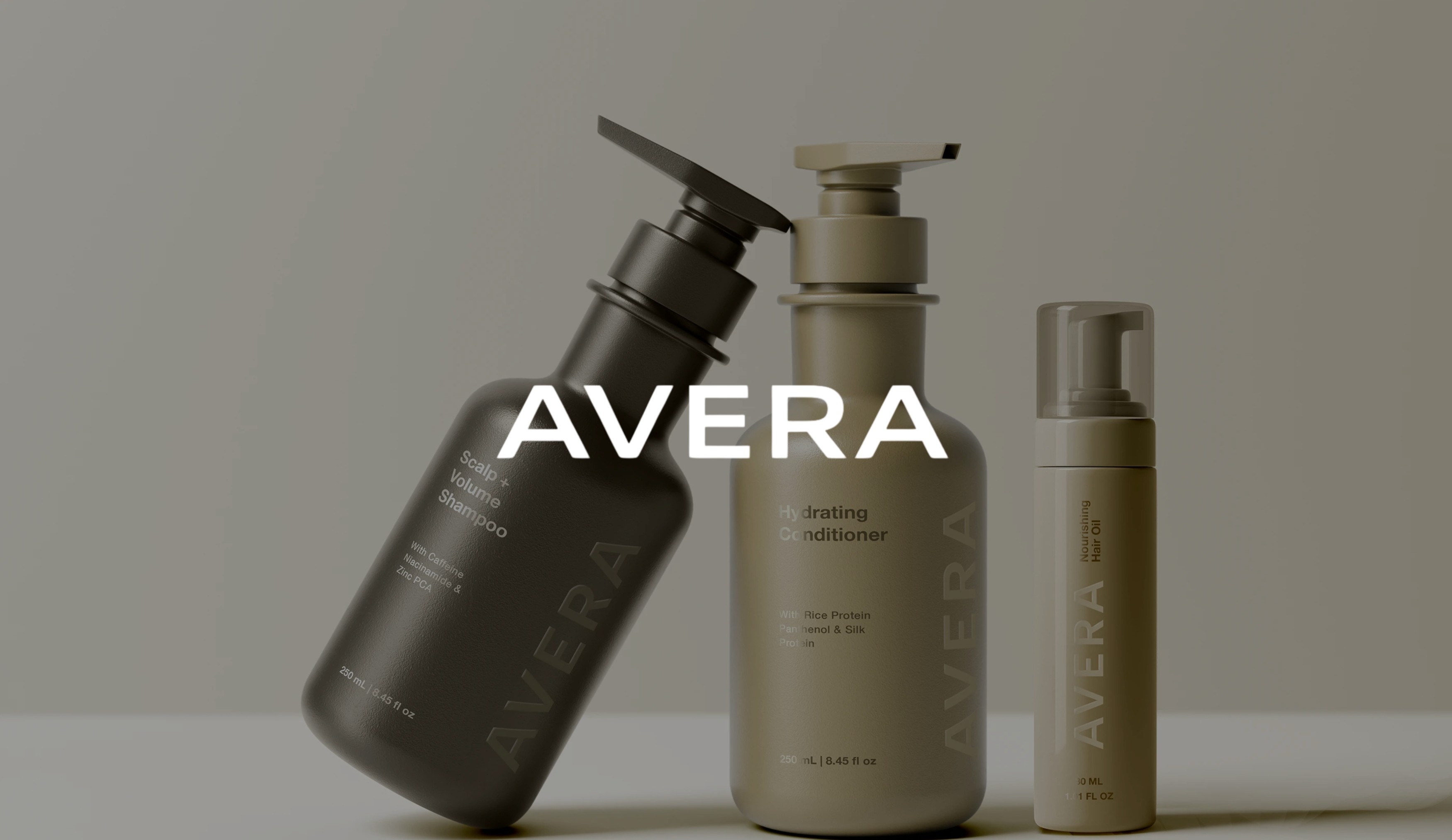
The challenge was to develop a cohesive brand that communicates performance without relying on exaggerated claims or visual excess. The product line needed to clearly differentiate between four distinct functions, scalp care, hydration, repair, and protection, while maintaining a unified identity across every item. The goal was a brand that feels premium, intentional, and effortless at every touchpoint.
THE CRAFT
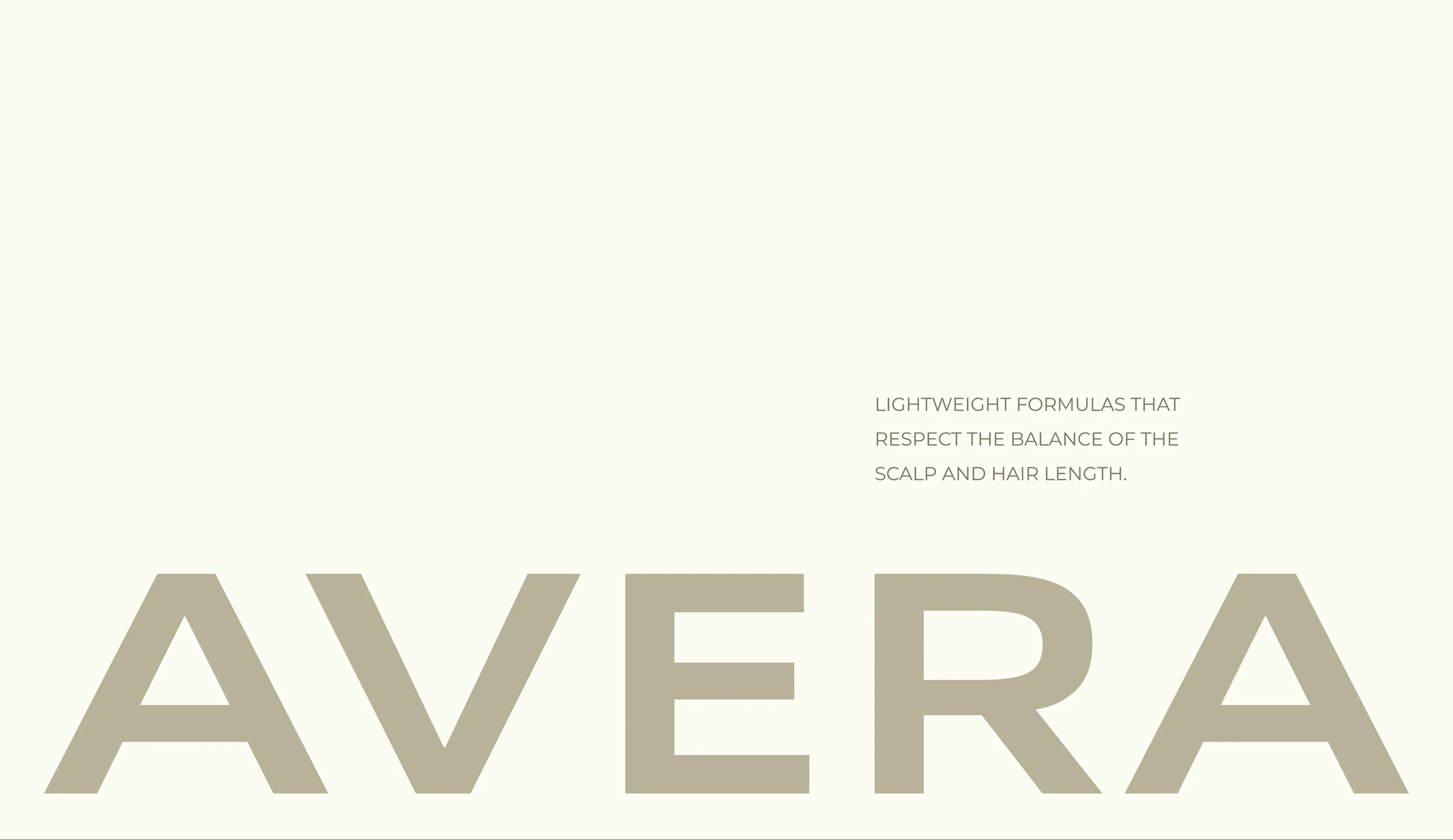
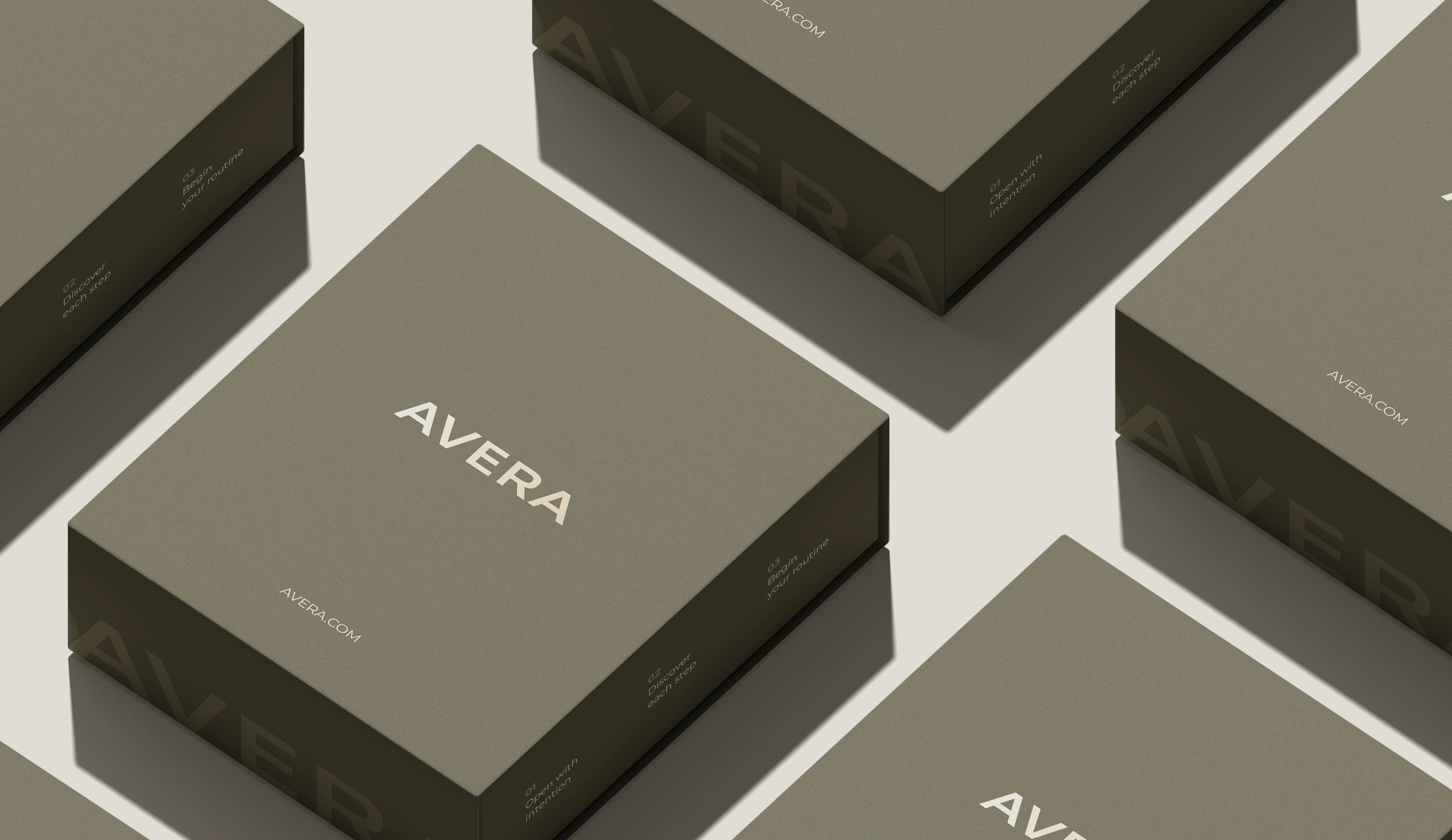
The visual language was built around minimalism and refinement, combining technical credibility with a calm, modern aesthetic. A restrained colour system and precise typography carry the identity across packaging and communications without ever feeling clinical or cold. Each product sits within the wider system clearly and deliberately, its function legible at a glance without breaking the visual unity of the range. The result is packaging that feels considered in hand and coherent on a shelf, a design language that earns trust through clarity rather than spectacle.
THE OUTCOME
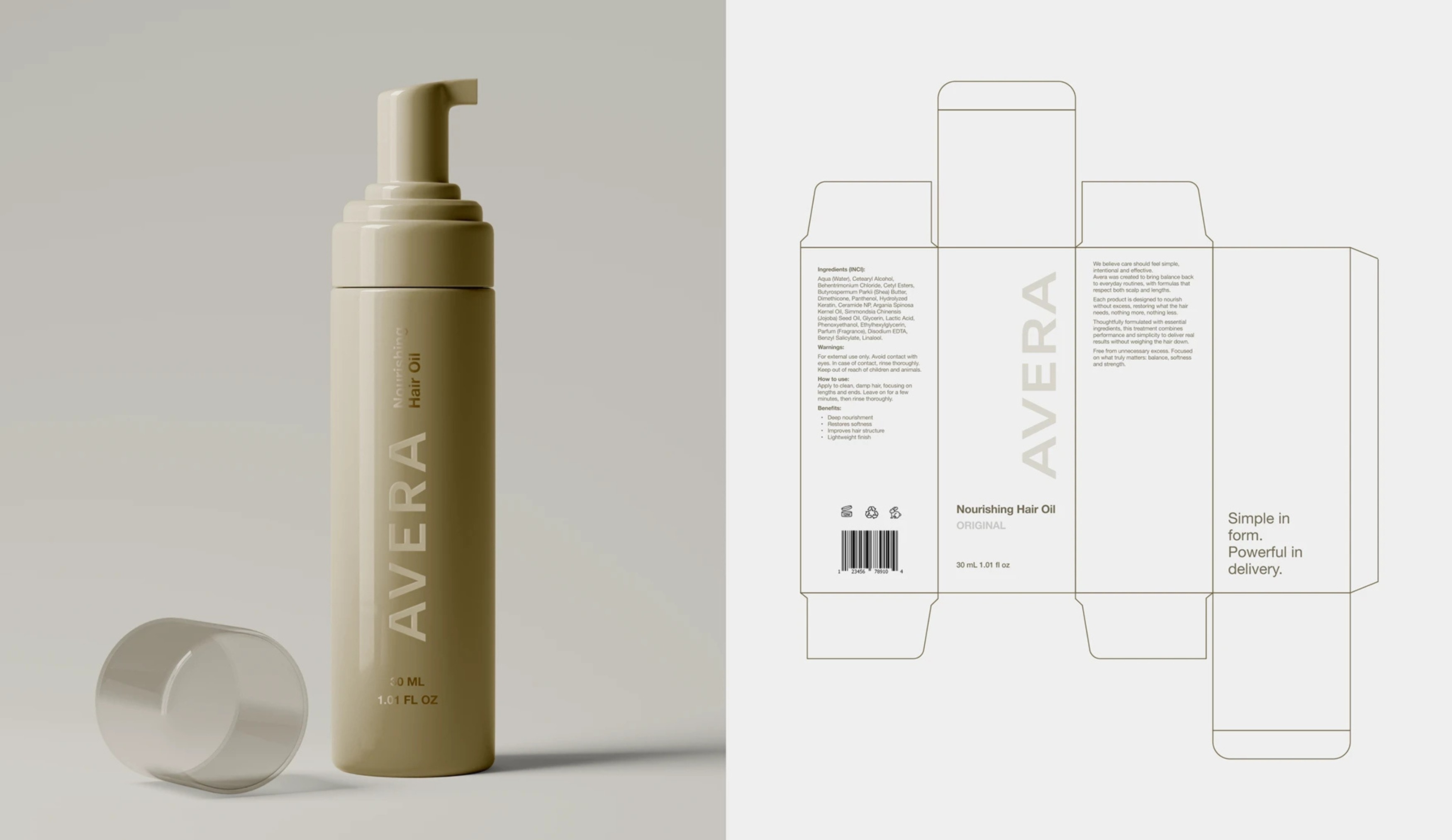
Avera stands as a brand where nothing competes and nothing overstates. A complete product system with a unified identity, structured around genuine functional differentiation and expressed through a visual language that is as calm and effective as the formulations it represents.