Caudalie

Caudalie, a French beauty brand founded in Bordeaux in 1995 by Mathilde and Bertrand Thomas. Built on the science of vino-therapy, it pioneered the use of grape-derived ingredients in skincare before the rest of the world caught up. Rooted in sustainability and scientific research, Caudalie has spent three decades earning the trust of a loyal global following in one of the most competitive markets in the world.

Caudalie, a French beauty brand founded in Bordeaux in 1995 by Mathilde and Bertrand Thomas. Built on the science of vino-therapy, it pioneered the use of grape-derived ingredients in skincare before the rest of the world caught up. Rooted in sustainability and scientific research, Caudalie has spent three decades earning the trust of a loyal global following in one of the most competitive markets in the world.

Caudalie, a French beauty brand founded in Bordeaux in 1995 by Mathilde and Bertrand Thomas. Built on the science of vino-therapy, it pioneered the use of grape-derived ingredients in skincare before the rest of the world caught up. Rooted in sustainability and scientific research, Caudalie has spent three decades earning the trust of a loyal global following in one of the most competitive markets in the world.

Indsutry

Beauty

Scope

Brand Identity

Market

Global
Sample

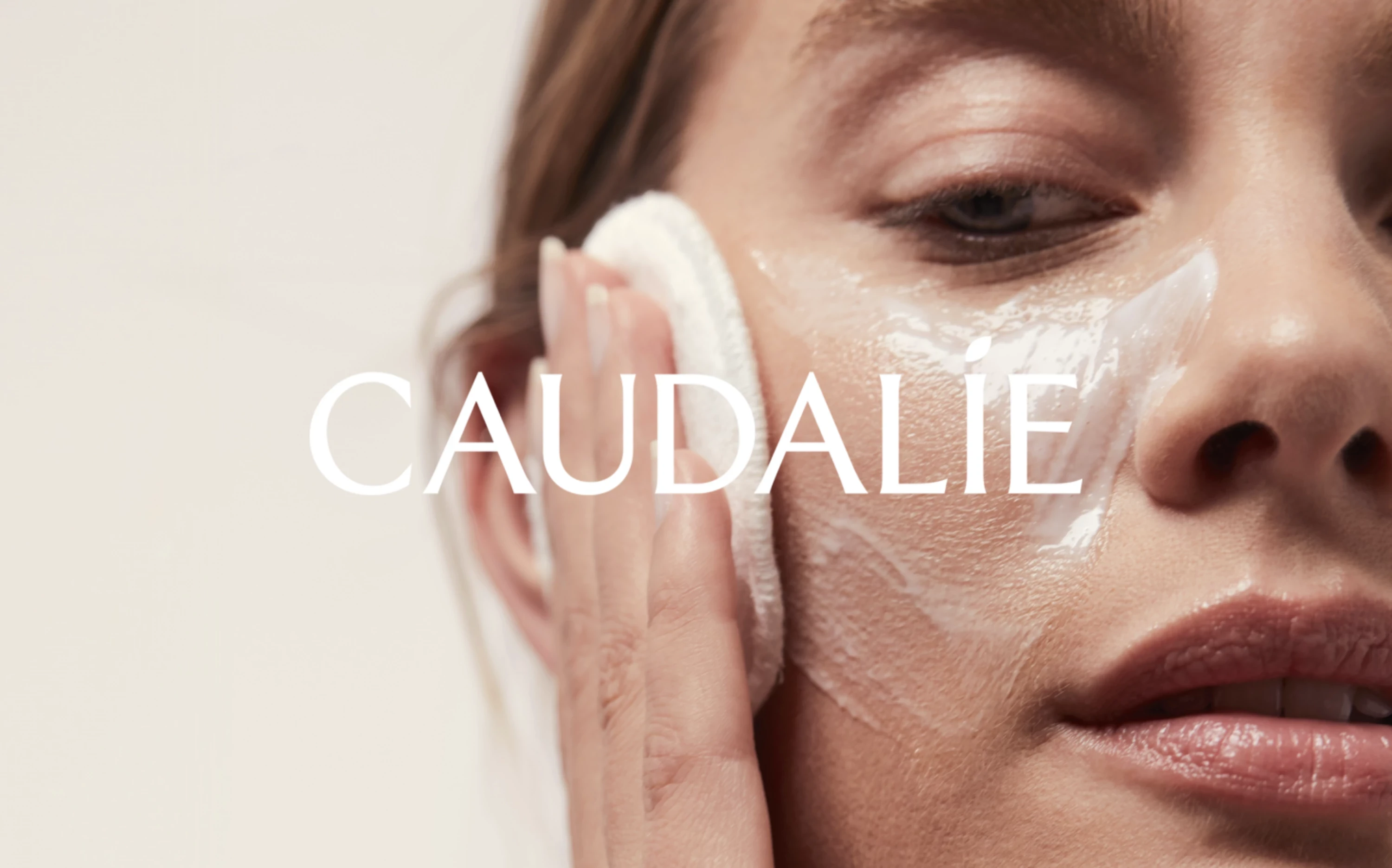
The skincare industry is in constant evolution, Consumer expectations around clean formulations, sustainable sourcing, and brand authenticity have never been higher. At the same time, the market has never been more crowded, with new brands launching daily and heritage names fighting harder than ever to stay culturally relevant. In this environment, a strong and consistent visual identity is not a nice to have. It is what separates the brands people trust from the ones they scroll past. For a brand like Caudalie, with genuine roots, real science, and a loyal community already behind it, the opportunity was not just to keep up with the market. It was to set the standard for what a modern, sustainable beauty brand could look and feel like.

The skincare industry is in constant evolution, Consumer expectations around clean formulations, sustainable sourcing, and brand authenticity have never been higher. At the same time, the market has never been more crowded, with new brands launching daily and heritage names fighting harder than ever to stay culturally relevant. In this environment, a strong and consistent visual identity is not a nice to have. It is what separates the brands people trust from the ones they scroll past. For a brand like Caudalie, with genuine roots, real science, and a loyal community already behind it, the opportunity was not just to keep up with the market. It was to set the standard for what a modern, sustainable beauty brand could look and feel like.

Challenge

Caudalie was already successful. Yet, some of its brand codes were used without clear guidelines and needed to be updated, such as the original grape drawing on the packaging, the typography, and the color ranges. The brand's visual touchpoints lacked unifying concepts and felt fragmented. Overall, the brand needed to simplify its principles and apply them thoroughly to get more impact at its points of sale and in its communications. Like tired skin in need of rejuvenation, Caudalie sought a revitalizing facelift.
Solution

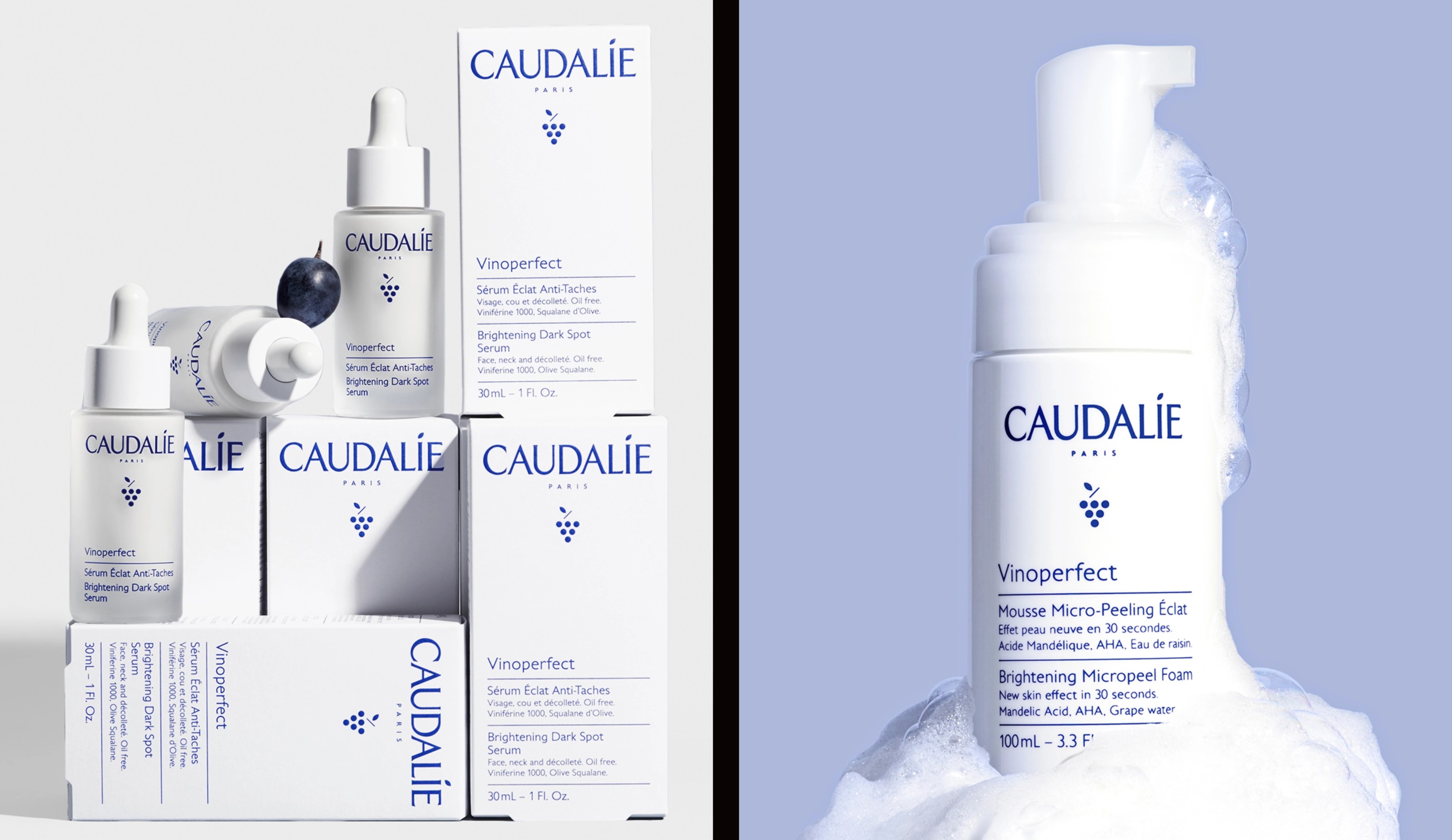
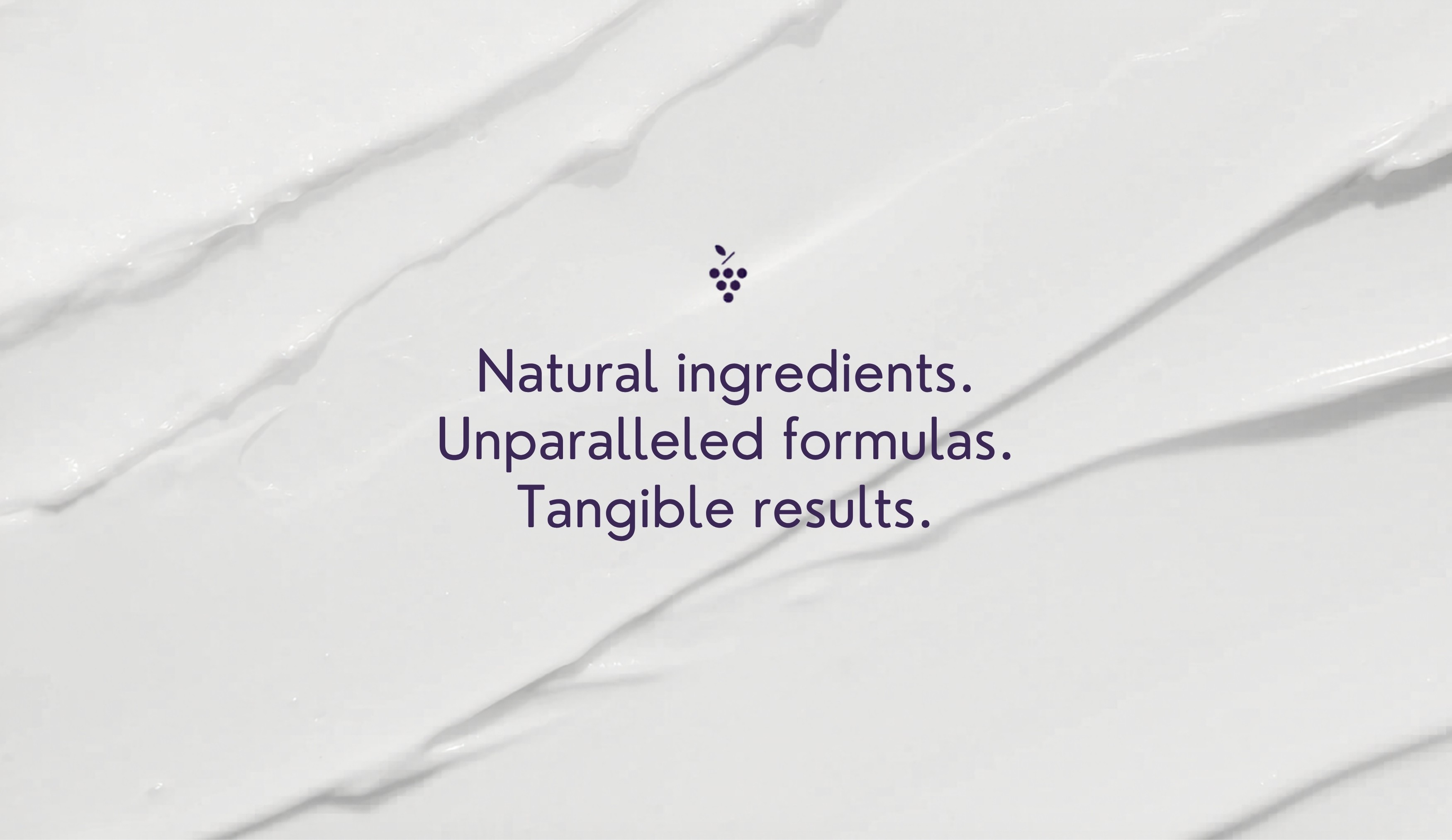
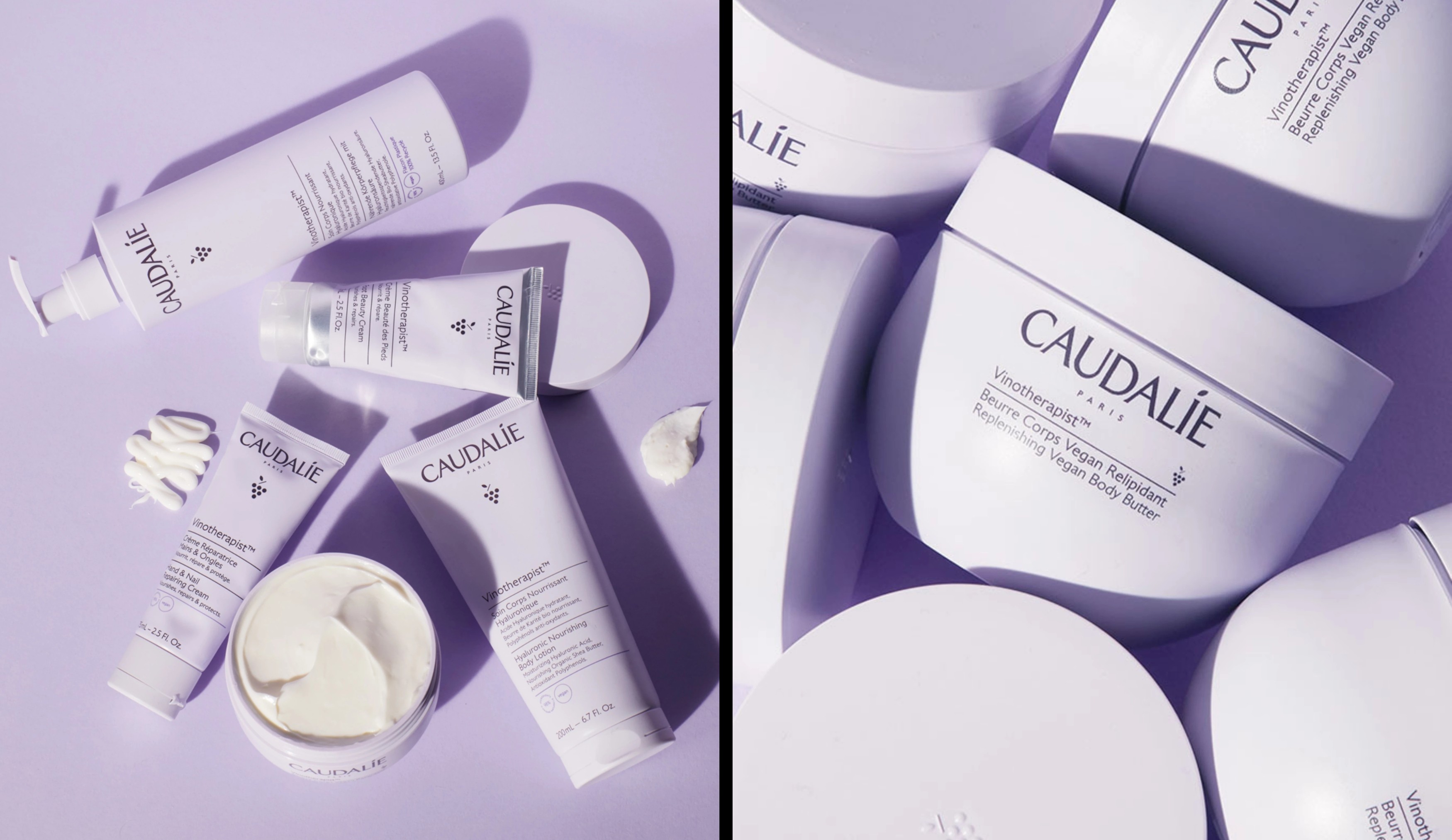
In a bold move, the decision was made to rebrand Caudalie from the ground up, starting with a single pack rather than a top-down approach. Initial transformations, such as logo redesign, introducing a new grape icon, proposing fresh color palettes, and crafting a bespoke typeface, were first tested on packaging before being applied across all brand touchpoints. This unconventional yet highly effective process is detailed in the article "Backwards Branding" by Base Partner Thierry Brunfaut.

Working in co-creation, the Caudalie and Base teams meticulously sourced the finest materials to fulfill the founder’s environmental commitments. This initial phase prompted a comprehensive review of the entire product range, leading to the adoption of "color-blocking" to unify various product lines for a cohesive visual identity. Alongside providing artistic direction, refining the brand's tone of voice and providing consultancy for their digital channels, the result was a refreshed identity that felt entirely new without losing any of what made Caudalie, Caudalie.
Outcome

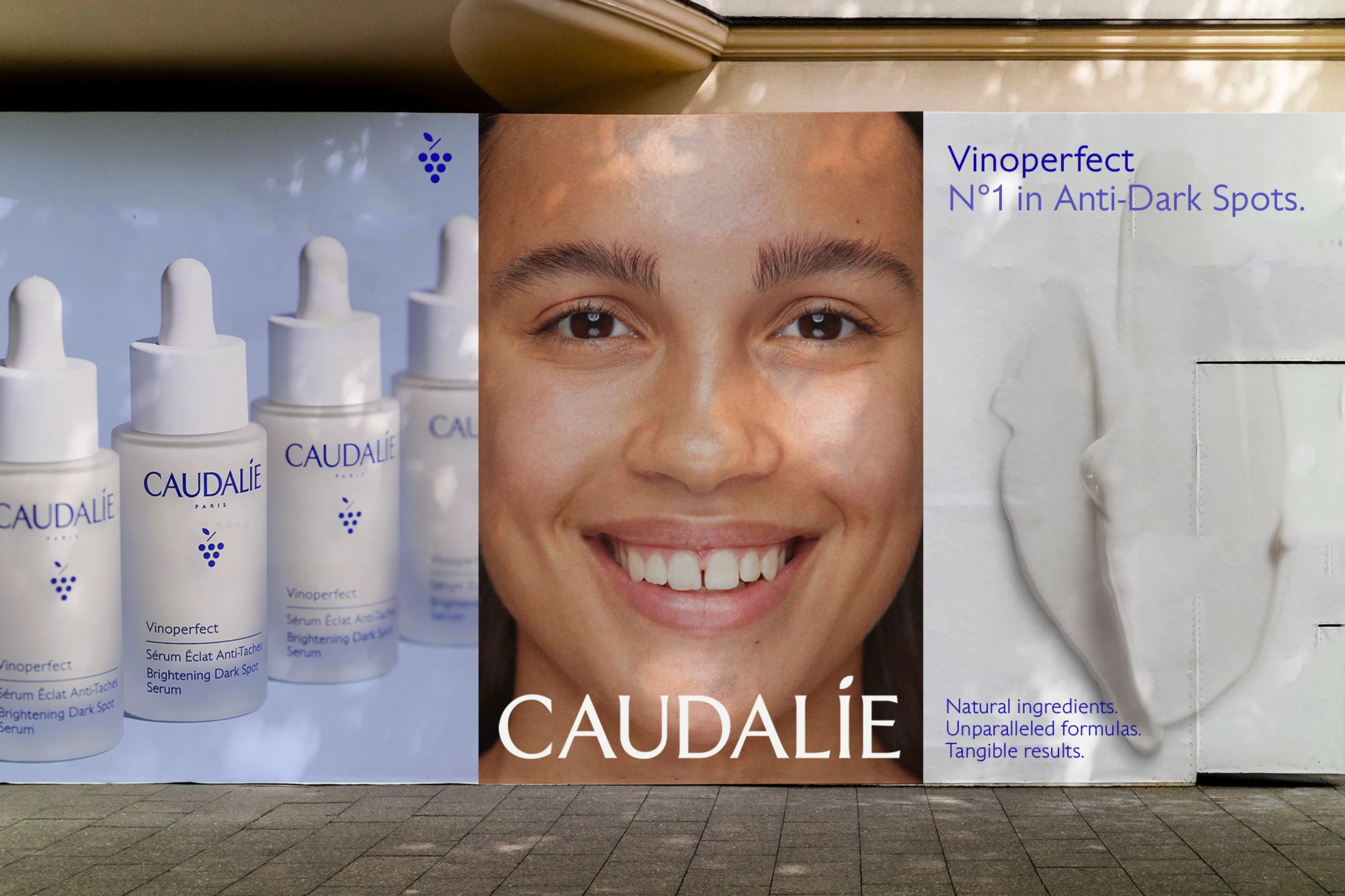
A coherent visual identity, consistent brand codes, and a sharpened tone of voice gave Caudalie the tools to show up with confidence across every surface. Continuing our close partnership, Aurra serves as creative consultants, adapting brand codes to meet evolving market demands while ensuring Caudalie remains agile and contemporary. In 2025, the brand recorded a 23% increase in performance.
Next Project

Merise

Next Project

Merise

© 2026 Aurra. All Rights Reserved.

© 2026 Aurra. All Rights Reserved.

© 2026 Aurra. All Rights Reserved.