Cadmus
Indsutry
Ed-tech
Scope
Rebranding
Market
B2C
THE BRIEF
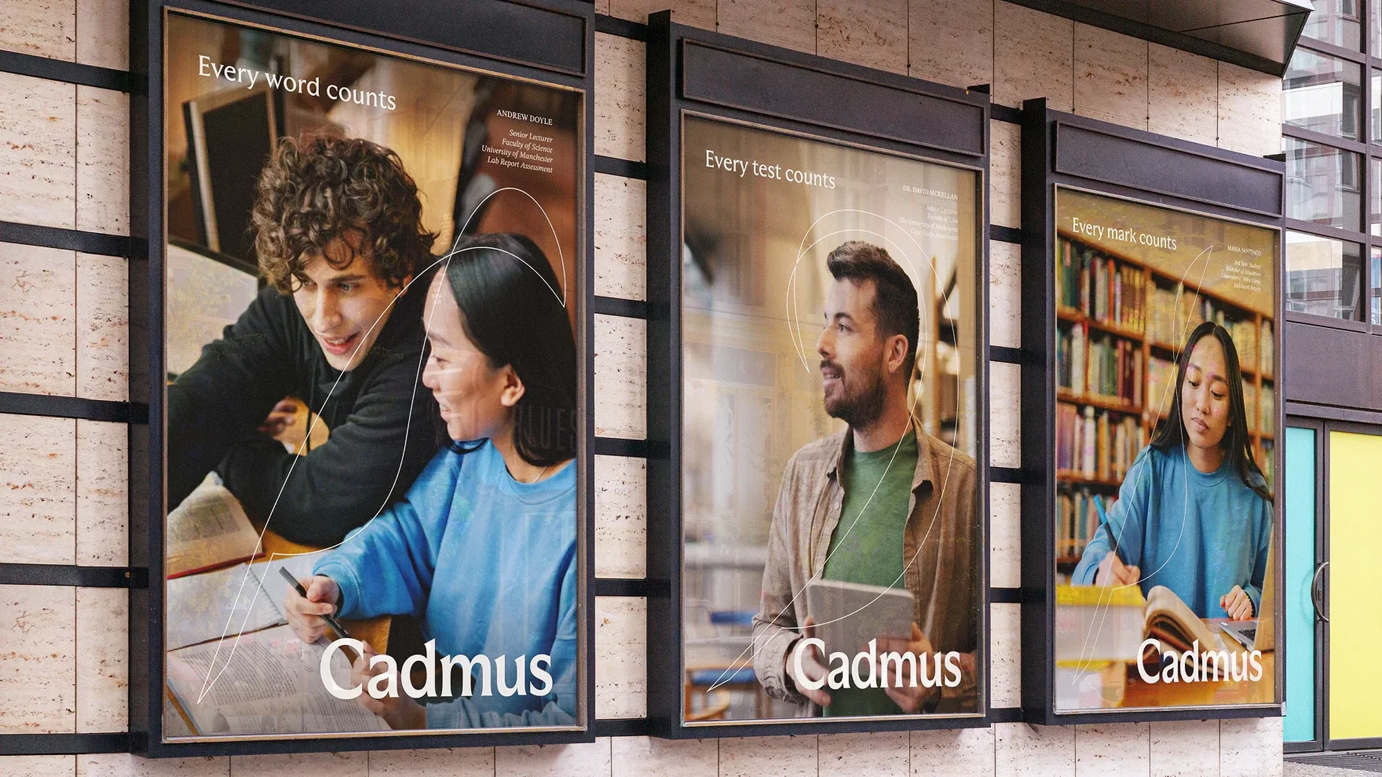
Cadmus came to Aurra wanting a more modern identity that would resonate with universities. The existing brand featured a quill, already well established as an icon among their university clients. The challenge was to honour that equity while evolving it into something that could sit naturally within university environments, connect meaningfully with institutions, and elevate Cadmus out of the typical SaaS visual landscape.
THE MAKING
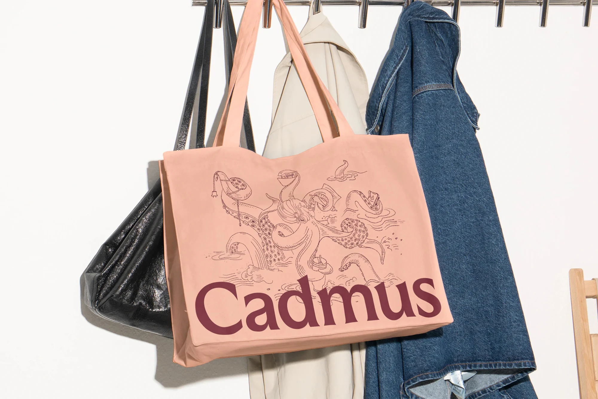
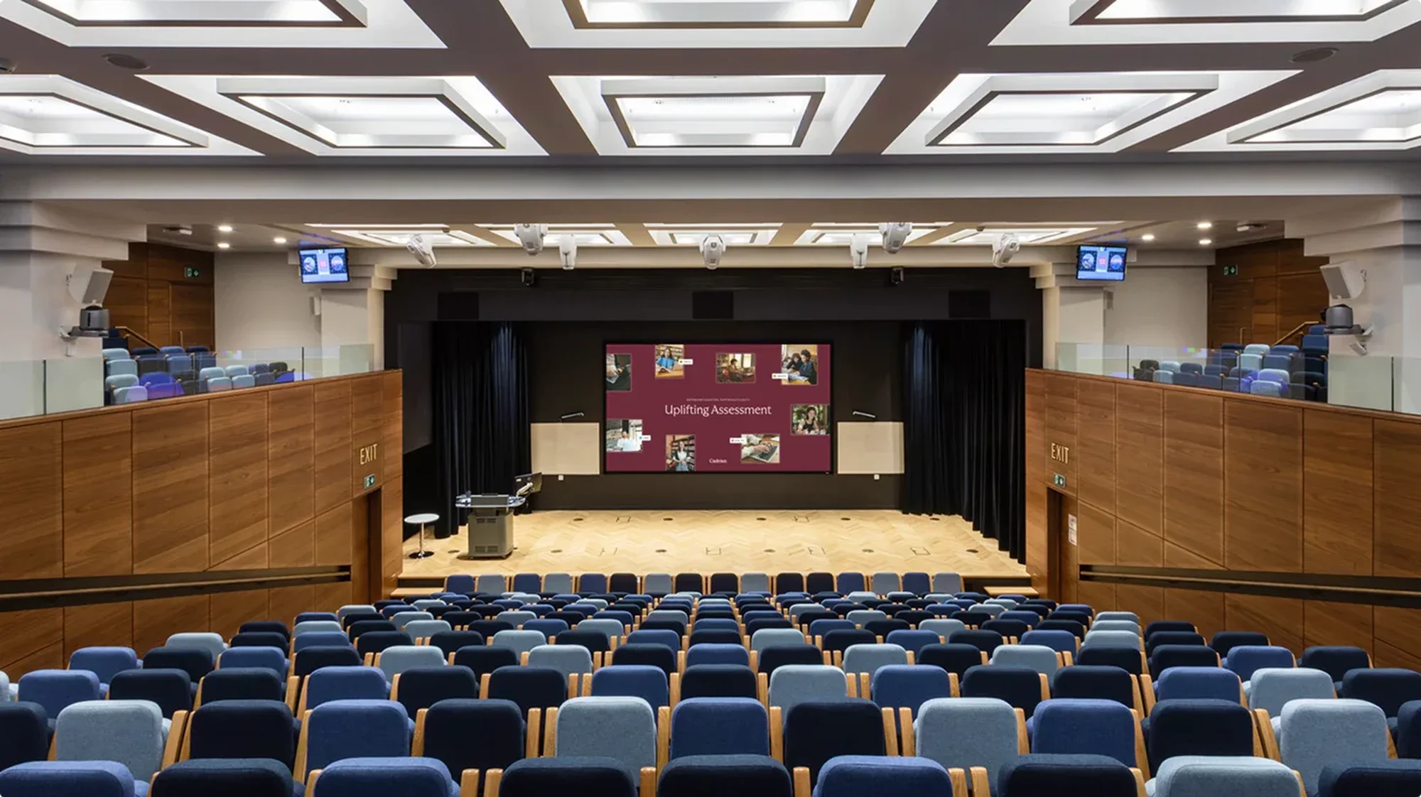
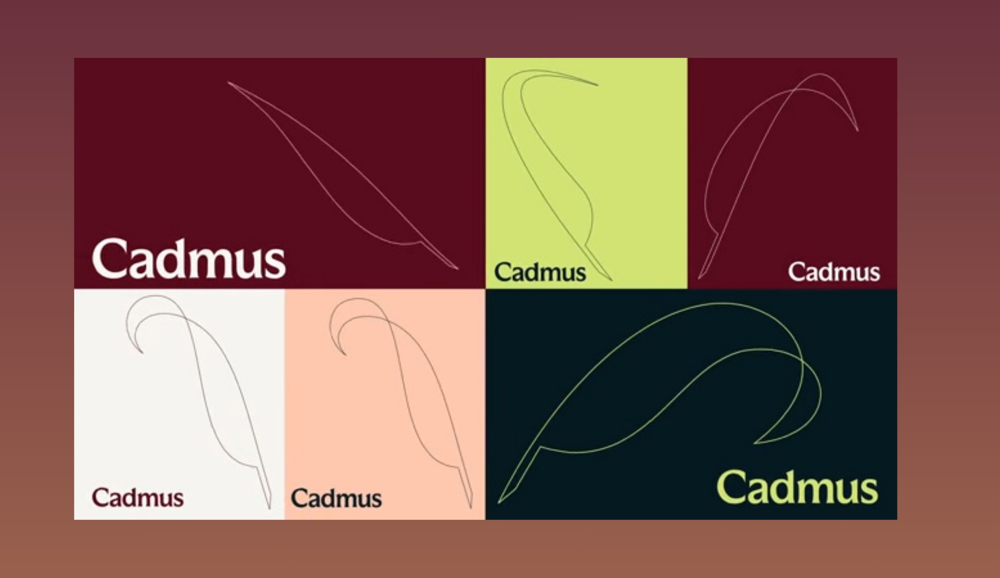
Rather than abandon the quill, we evolved it. Tilted to 45 degrees and streamlined, it was brought to life through animation, moving with flourish as if wielded by a busy academic rather than sitting dormant on a page. The colour palette drew from an unexpected source. Renaissance-era paintings provided the reference point, rich deep tones colour-picked from works created during a period when education thrived. To keep the identity from feeling stuffy, we created Renaissance-style illustrations featuring modern-day students and academics, phones in hand, cats in laps, crafted through a mixed media collage process before being vectorised and colourised for flexibility across digital and print. The typographic system paired Realm, a semi-serif headline typeface blending Old English and Roman influences, with Inter, a modern open-source variable font, balancing historical reference with contemporary function across platform interfaces, marketing materials, and event collateral. The strategic proposition, Uplifting Assessment, ran through every decision. Website animations float upward. The quill flicks and sweeps. Every motion reinforces a feeling of lightness against what students and educators know can be a heavy, stressful process.
THE OUTCOME
The refreshed brand sits naturally within university environments, connecting more meaningfully with institutions while standing apart from the competitors it shares a category with. A sophisticated and holistic aesthetic, built through detailed research, rigorous testing across UI, print, and social media, and a comprehensive event programme extending the brand into physical spaces, gave Cadmus an identity that reflects what it has always stood for. Making assessment feel less like a burden and more like something worth doing well.